Improve Decision Making with a Simple Gain-to-Loss Ratio


Because we’re in the midst of a bull cycle, risk management tends to be an afterthought for many people. However, with the lessons learned from 2008 to 2009, MPF Research thought it would be interesting to look at ways to quantify risk. For this piece, let’s investigate the gain-to-loss ratio. Don’t be surprised if this metric is new to you. Gain-to-loss is commonly used in the hedge fund industry to help corral investment returns that don’t follow a normal distribution. For our discussion here, we’re not trying to determine whether or not real estate returns are normally distributed, but we think the metric’s output is a helpful and advantageous way to assist real estate investors in the decision making process. In other words, the gain-to-loss ratio is another lens through which to analyze your investment decisions.
The Variables
Let’s start with the basic definition of gain-to-loss ratio:
![]()
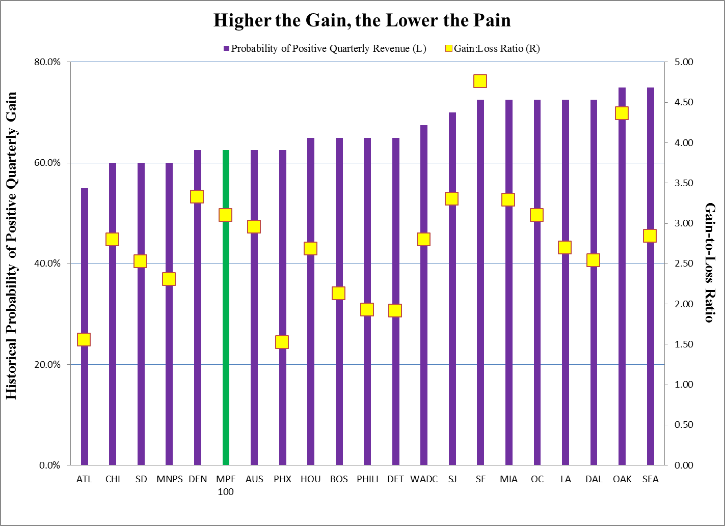
MPF Research picked 20 metros to analyze (see chart below) using quarterly revenue change over the 40 quarters from 4th quarter 2004 through 3rd quarter 2014. We defined a positive quarter as any quarter in which the metro recorded quarterly revenue growth. On the flip side, a negative quarter is one in which zero or negative revenue change was posted.
Using MPF Research data, we can see that Oakland and Seattle led the way by producing positive quarterly revenue growth in 30 quarters, or 75% of the time. On the other hand, Atlanta and Chicago were at the bottom, with a respective 55% and 60% historical probability of producing revenue gains.
By combining the historical probability of positive quarterly revenue growth with the average gain in the good times and the average loss in the bad times, we have our ratio. In absolute terms, the higher the gain-to-loss ratio, the more favorable a metro is, from a risk/reward perspective. And as for your decision-making process? We’ll call it a leg up on protecting your downside risk.