Cap Rate Yield Spread as a Buy or Sell Signal


Real estate investors frequently discuss cap rate spreads as a forward-looking indicator, but is conventional analysis ignoring an important data point? Traditionally, the spread has been thought of in terms of cap rates relative to the 10-year U.S. Treasury bond and Baa corporate bonds. However, there could be another way to look at this time-tested and trusted metric. One such derivative is viewing the cap rate spread between primary and secondary markets.
The logic is as follows: taking a page from the bond market, technicians carefully watch the yield spread between higher-quality and lower-quality bonds to measure investor confidence. The theory goes, as confidence increases, investors are more willing to move up the risk curve and invest in lower-quality bonds for the added yield. As a result, the yield spread between higher-quality bonds typically contracts. Conversely, when investors are less confident about the economy and accompanying credit risk, they are less willing to invest in lower-quality bonds and the yield spread typically widens.
Let’s apply this same thinking to the apartment market. For this case study, we will use the primary markets Bay Area, Boston, Chicago, Los Angeles, New York City and Washington D.C. as a proxy for higher-quality markets and secondary markets Atlanta, Baltimore, Charlotte, Dallas, Denver, Houston, Miami, Minneapolis, Philadelphia, Phoenix, San Diego, Seattle and Tampa Bay as a proxy for lower-quality markets.
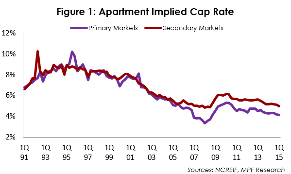
It seems reasonable to expect the primary markets to be valued at lower cap rates as primary markets are viewed as more liquid and contain higher barriers to entry, which usually results in higher NOI growth expectations. Historical data in Figure 1 supports this premise. From 1st quarter 1991 to 1st quarter 2015, primary markets have maintained lower implied cap rates 81.4% of the time.
The Absolute Yield Spread
Moving past the raw cap rate data, let’s turn our attention to the absolute yield spread in Figure 2. To begin, a negative yield spread indicates cap rates for the secondary markets are lower than the primary markets. Meanwhile, a positive yield spread indicates the opposite – cap rates in primary markets are lower than secondary markets. The key takeaway is this: at the extreme, measured as plus or minus two standard deviations, the absolute yield spread provides a contrarian technical signal. When the absolute yield spread moves below a normalized level, this suggests either an inefficient market or an overpricing of risk. This occurred in 3rd quarter 1995 and 4th quarter 2001, and both times proved to be a great time to buy apartments.
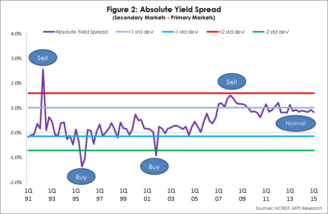
Conversely, when the absolute yield spread moves above a normalized level, investors are driven by greed and risk is underpriced. This occurred in 2nd quarter 1992 and 1st quarter 2008. Interestingly enough, this proved a great time to sell apartments, as total returns turned negative in 1991-1992 and again in 2008-2009.
The Relative Yield Spread
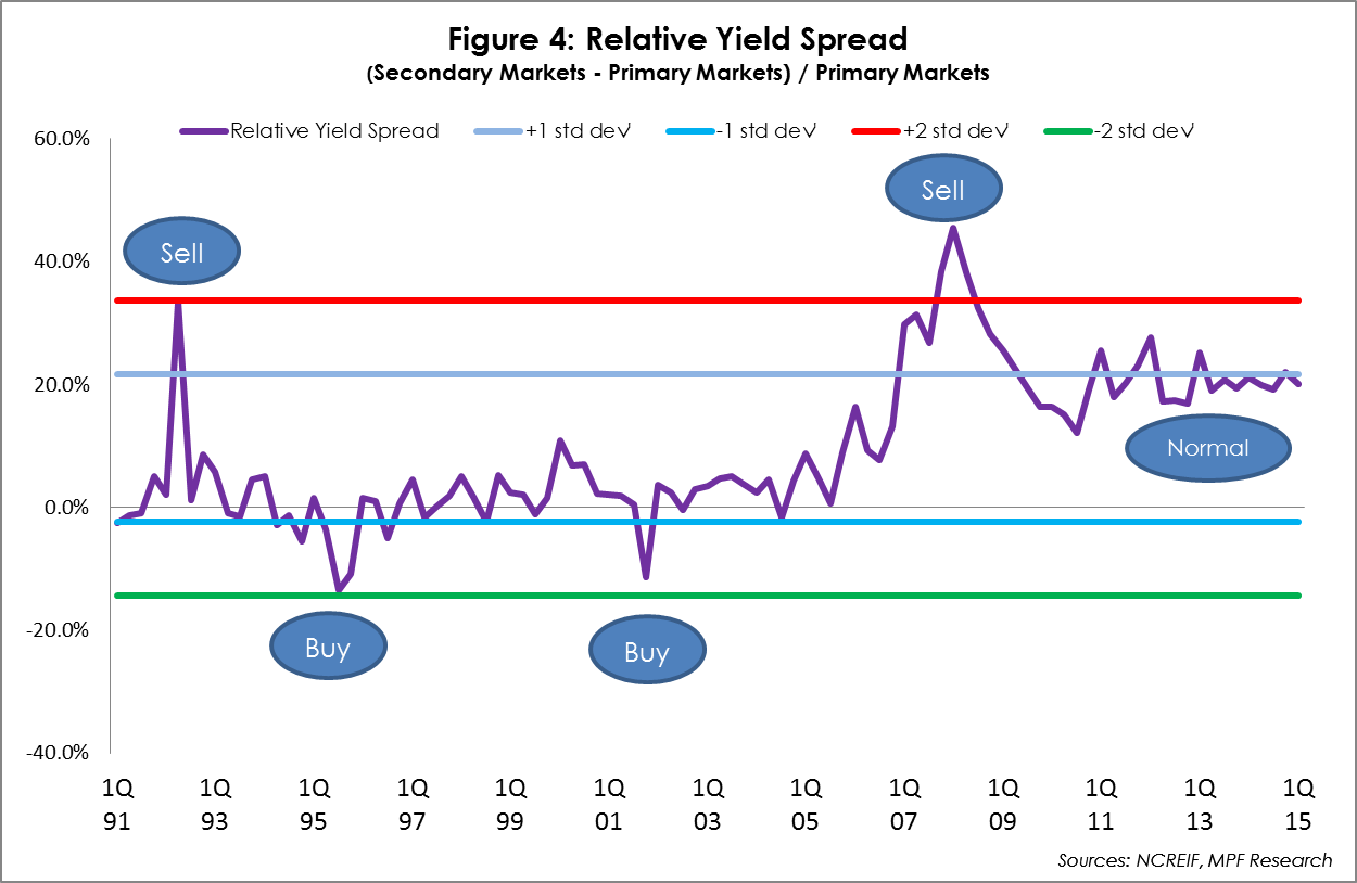
Looking at the data in a slightly different way, we get the same results. Figure 4 illustrates the same data as a ratio. We see greater movement, but the same extreme technical indicators.
Conclusion
To summarize, there are three key points:
- For the apartment sector, using a cap rate spread between primary and secondary markets has merit on a historical basis.
- Despite rising prices and cap rate compression, the current market is not like the market in 1st quarter 2008. The apartment sector currently operates within the normal range, albeit on the high side. However, moving forward, investors should be cognitive of where we go from here.
- Finally, technical analysis should be used in conjunction with fundamental analysis rather than in isolation to enhance the overall investment decision.